


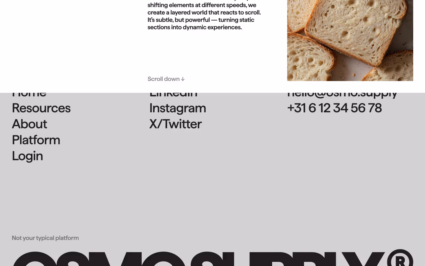


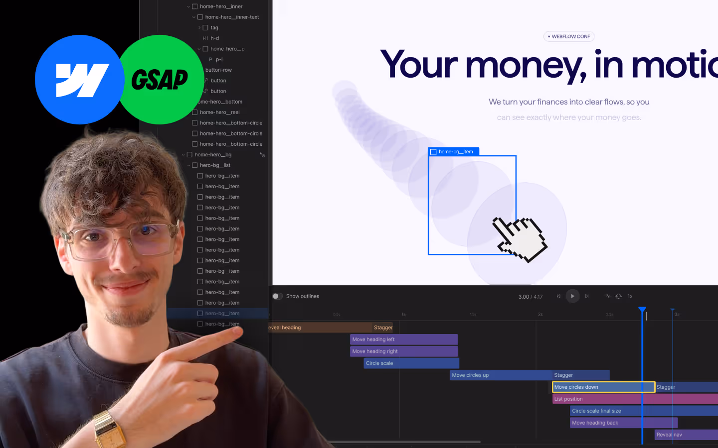
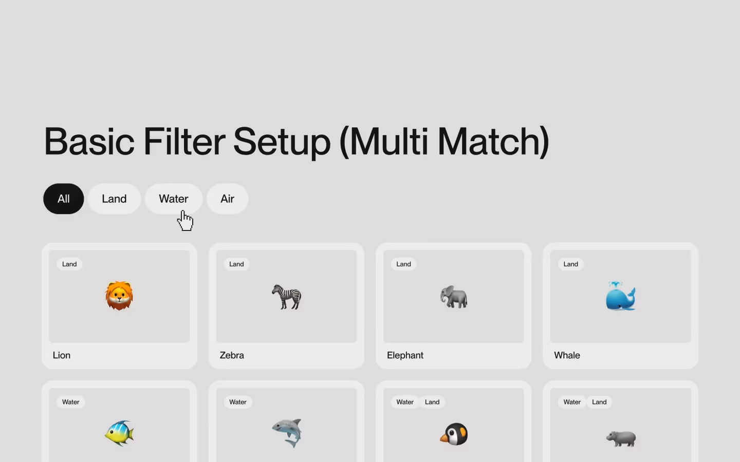
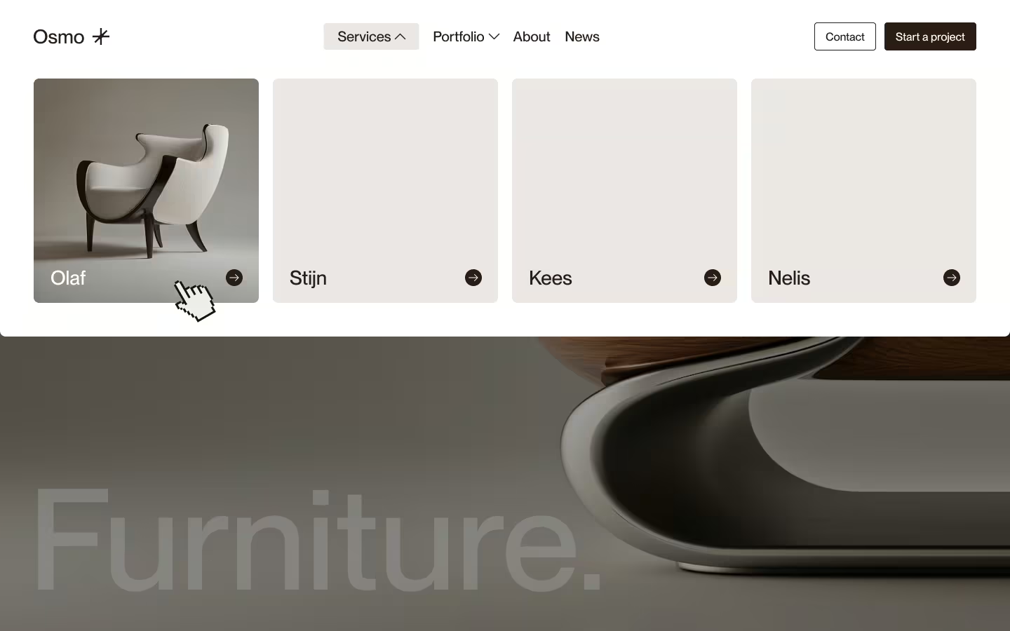
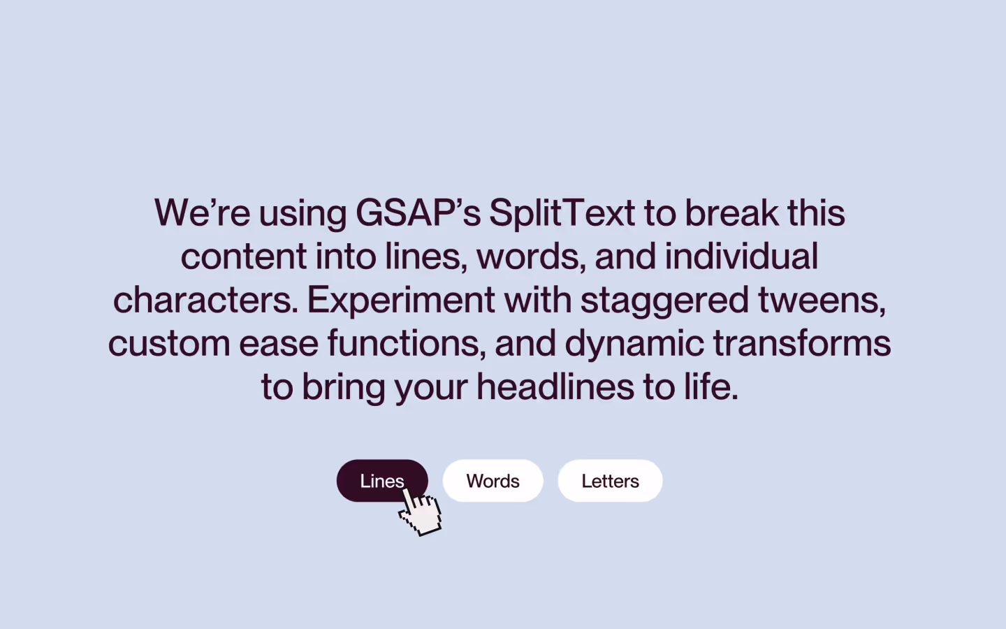
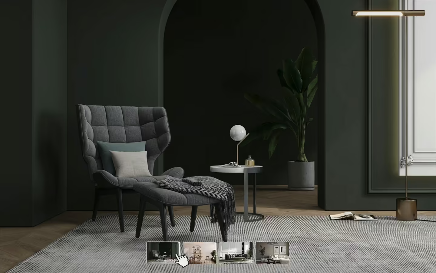
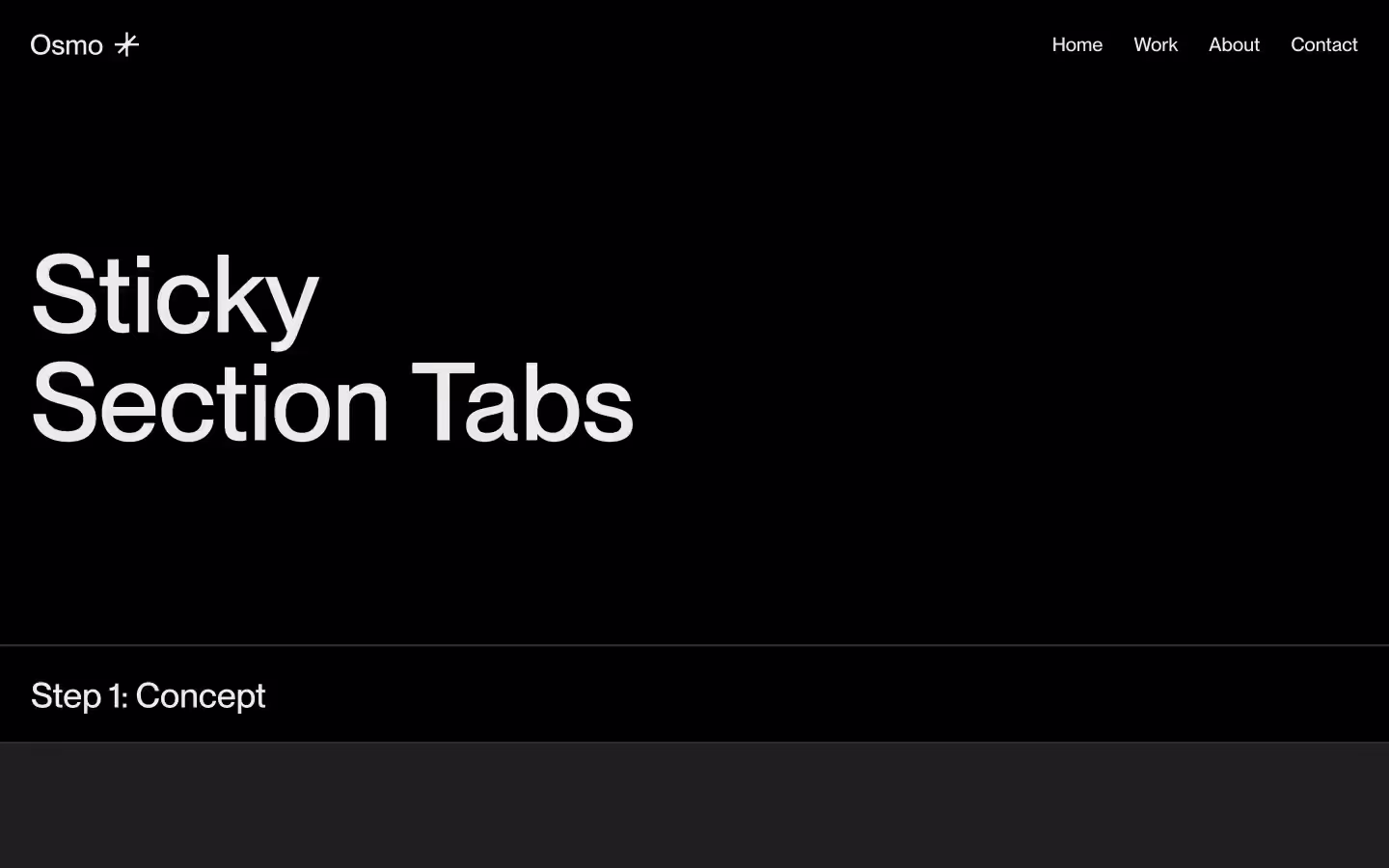
Tab System with Autoplay Option
Documentation
Webflow
Code
Setup: External Scripts
External Scripts in Webflow
Make sure to always put the External Scripts before the Javascript step of the resource.
In this video you learn where to put these in your Webflow project? Or how to include a paid GSAP Club plugin in your project?
HTML
<script src="https://cdn.jsdelivr.net/npm/gsap@3.12.7/dist/gsap.min.js"></script>Step 1: Copy structure to Webflow
Copy structure to Webflow
In the video below we described how you can copy + paste the structure of this resource to your Webflow project.
Copy to Webflow
Webflow structure is not required for this resource.
Step 1: Add HTML
HTML
<div data-tabs-autoplay-duration="5000" data-tabs="wrapper" data-tabs-autoplay="true" class="tab-layout__wrap">
<div class="tab-layout__col">
<div class="tab-content__wrap">
<div class="tab-content__inner">
<div class="tab-content__top">
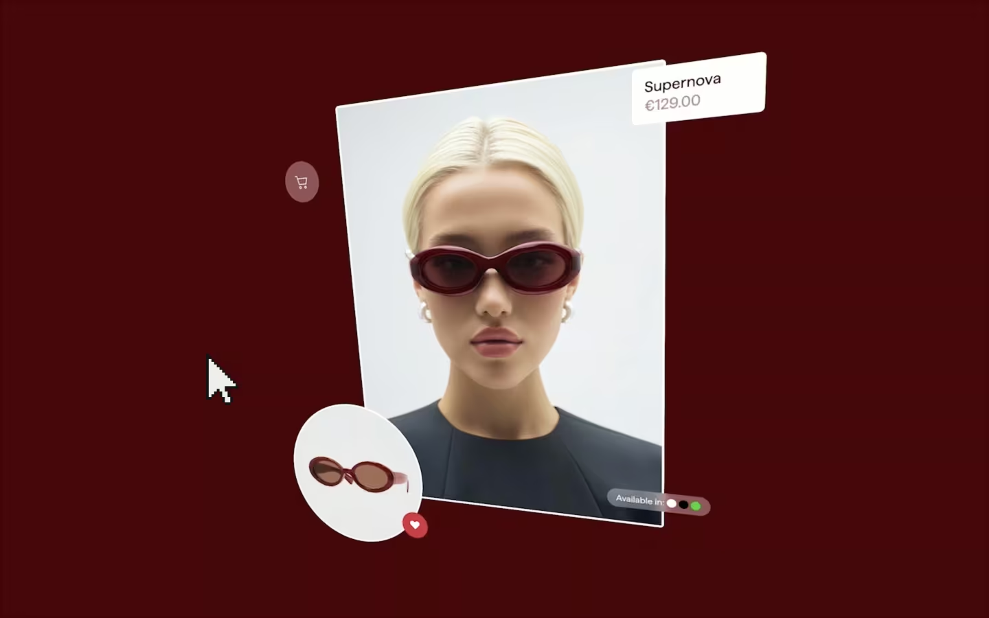
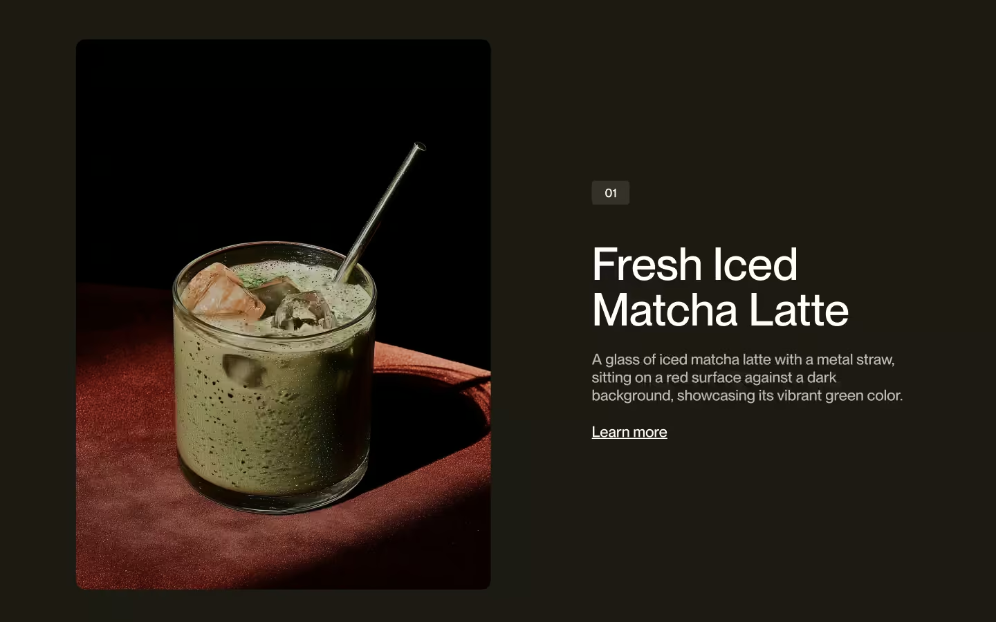
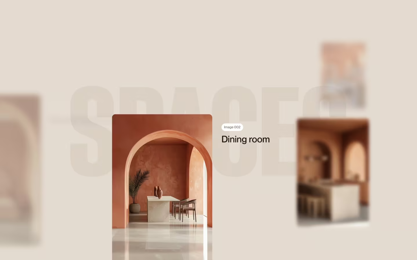
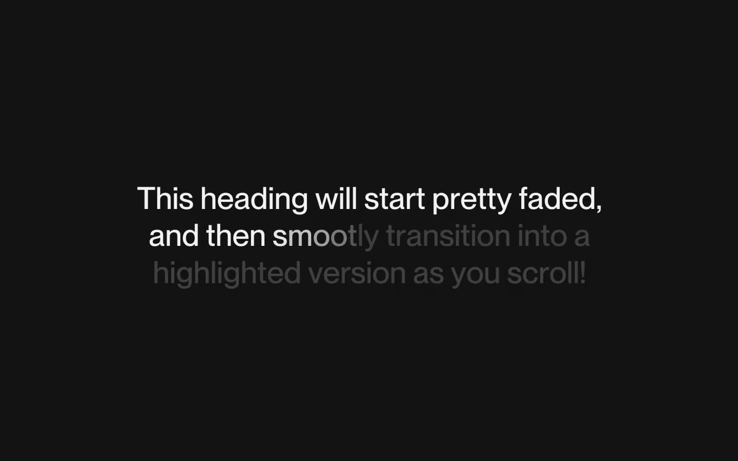
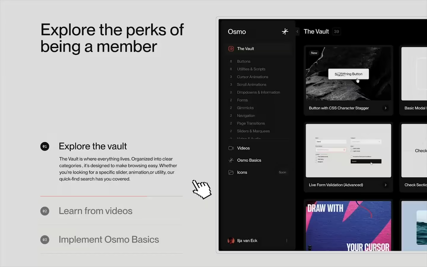
<h1 class="tab-heading">Explore the perks of being a member</h1>
</div>
<div role="tablist" class="tab-content__bottom">
<a role="tab" data-tabs="content-item" href="#" class="tab-content__item w-inline-block">
<div class="tab-content__item-main">
<div class="content-item__nr">
<div>01</div>
</div>
<h2 class="content-item__heading">Explore the vault</h2>
</div>
<div data-tabs="item-details" class="tab-content__item-detail">
<div class="tab-description__spacer"></div>
<p class="tab-description">The Vault is where everything lives. Organized into clear categories , it’s designed to make browsing easy. Whether you’re looking for a specific slider, animation,or utility, our quick-find search has you covered. </p>
<div class="tab-description__spacer"></div>
</div>
<div class="tab-content__item-bottom">
<div data-tabs="item-progress" class="tab-progress"></div>
</div>
</a>
<a role="tab" data-tabs="content-item" href="#" class="tab-content__item w-inline-block">
<div class="tab-content__item-main">
<div class="content-item__nr">
<div>02</div>
</div>
<h2 class="content-item__heading">Learn from videos</h2>
</div>
<div data-tabs="item-details" class="tab-content__item-detail">
<div class="tab-description__spacer"></div>
<p class="tab-description">We also include videos that explain the concept, go deeper on the subject, or maybe might spark some new ideas for the resources that you're using.</p>
<div class="tab-description__spacer"></div>
</div>
<div class="tab-content__item-bottom">
<div data-tabs="item-progress" class="tab-progress"></div>
</div>
</a>
<a role="tab" data-tabs="content-item" href="#" class="tab-content__item w-inline-block">
<div class="tab-content__item-main">
<div class="content-item__nr">
<div>03</div>
</div>
<h2 class="content-item__heading">Implement Osmo Basics</h2>
</div>
<div data-tabs="item-details" class="tab-content__item-detail">
<div class="tab-description__spacer"></div>
<p class="tab-description">These are the foundations you’ll rely on for every award-worthy project. Master the basics, and the flashy stuff will actually have something solid to stand on.</p>
<div class="tab-description__spacer"></div>
</div>
<div class="tab-content__item-bottom">
<div data-tabs="item-progress" class="tab-progress"></div>
</div>
</a>
</div>
</div>
</div>
</div>
<div class="tab-layout__col">
<div aria-live="polite" role="region" class="tab-visual__wrap">
<div id="tab1" data-tabs="visual-item" role="tabpanel" class="tab-visual__item active">
<div class="tab-visual__inner"><img src="https://cdn.prod.website-files.com/679013b2e01832b21eba1b5b/679016ba86e862ccd6750213_tab-asset-vault.avif" loading="lazy" alt="" class="tab-image"></div>
</div>
<div id="tab2" data-tabs="visual-item" role="tabpanel" class="tab-visual__item">
<div class="tab-visual__inner"><img src="https://cdn.prod.website-files.com/679013b2e01832b21eba1b5b/679016ba8f0f937c2b5b1d0f_tab-asset-videos.avif" loading="lazy" alt="" class="tab-image"></div>
</div>
<div id="tab3" data-tabs="visual-item" role="tabpanel" class="tab-visual__item">
<div class="tab-visual__inner"><img src="https://cdn.prod.website-files.com/679013b2e01832b21eba1b5b/679016bab4910a3b7a9e0e64_tab-asset-basics.avif" loading="lazy" alt="" class="tab-image"></div>
</div>
</div>
</div>
</div>HTML structure is not required for this resource.
Step 2: Add CSS
CSS
.tab-layout__wrap {
  z-index: 1;
  grid-row-gap: 3em;
  flex-flow: wrap;
  padding-left: 1em;
  padding-right: 1em;
  display: flex;
  position: relative;
}

.tab-layout__col {
  width: 50%;
  padding-left: .5em;
  padding-right: .5em;
}

.tab-content__inner {
  grid-column-gap: 3em;
  grid-row-gap: 3em;
  flex-flow: column;
  justify-content: space-between;
  align-items: flex-start;
  min-height: 100%;
  padding-top: 1em;
  padding-bottom: 0;
  padding-right: 2.5em;
  display: flex;
}

.tab-content__top {
  grid-column-gap: 2em;
  grid-row-gap: 2em;
  flex-flow: column;
  justify-content: flex-start;
  align-items: flex-start;
  display: flex;
}

.tab-heading {
  margin-top: 0;
  margin-bottom: 0;
  font-size: 3.5em;
  font-weight: 500;
  line-height: 1;
}

.tab-visual__wrap {
  aspect-ratio: 1.6;
  height: 50em;
  position: relative;
}

.tab-visual__item {
  visibility: hidden;
  justify-content: flex-start;
  align-items: center;
  width: 100%;
  height: 100%;
  display: flex;
  position: absolute;
}

.tab-visual__item.active {
  visibility: visible;
}

.tab-visual__inner {
  border: 1px solid #0003;
  border-radius: .5em;
  width: 100%;
  height: 100%;
  padding: .5em;
  overflow: hidden;
}

.tab-image {
  object-fit: cover;
  object-position: 0% 50%;
  border-radius: .25em;
  width: 100%;
  height: 100%;
  position: relative;
}

.tab-content__wrap {
  width: 100%;
  max-width: 36em;
  height: 100%;
  margin-left: auto;
  margin-right: 0;
}

.tab-content__bottom {
  flex-flow: column;
  justify-content: space-between;
  align-items: stretch;
  width: 100%;
  max-width: 30em;
  margin-top: 0;
  margin-bottom: 0;
  padding-left: 0;
  display: flex;
}

.tab-content__item {
  color: #131313;
  width: 100%;
  padding-top: 2em;
  padding-bottom: 2em;
  text-decoration: none;
  transition: opacity .25s;
  position: relative;
}

.tab-content__item-main {
  grid-column-gap: 2em;
  grid-row-gap: 2em;
  justify-content: flex-start;
  align-items: flex-start;
  width: 100%;
  display: flex;
}

.content-item__nr {
  color: #fff;
  background-color: #131313;
  border: 1px solid #131313;
  border-radius: 100em;
  justify-content: center;
  align-items: center;
  width: 2.5em;
  height: 2.5em;
  margin-top: .2em;
  font-family: RM Mono, Arial, sans-serif;
  font-size: .75em;
  font-weight: 400;
  transition: transform .4s cubic-bezier(.625, .05, 0, 1);
  display: flex;
}

.content-item__heading {
  margin-top: 0;
  margin-bottom: 0;
  font-size: 2em;
  font-weight: 500;
  line-height: 1;
}

.tab-content__item-detail {
  width: 100%;
  height: 0;
  padding-left: 4em;
  overflow: hidden;
}

.tab-description {
  margin-bottom: 0;
  font-size: 1em;
}

.tab-description__spacer {
  padding-top: 1em;
}

.tab-content__item-bottom {
  background-color: #0003;
  width: 100%;
  height: 1px;
  transition: background-color .2s;
  position: absolute;
  inset: auto 0% 0%;
}

.tab-progress {
  transform-origin: 0%;
  transform-style: preserve-3d;
  background-color: #ff4c24;
  width: 100%;
  height: 1px;
  transform: scale3d(0, 1, 1);
}

@media screen and (max-width: 991px) {
  .tab-layout__col {
    width: 100%;
    padding-left: 0;
    padding-right: 0;
  }

  .tab-content__inner {
    justify-content: space-between;
    align-items: stretch;
    padding: 0;
  }

  .tab-content__top {
    grid-column-gap: 1.5em;
    grid-row-gap: 1.5em;
  }

  .tab-visual__wrap {
    height: auto;
    padding-left: 0;
    padding-right: 0;
  }

  .tab-visual__item {
    overflow: hidden;
  }

  .tab-content__wrap {
    max-width: none;
    margin-left: 0;
  }
}

@media screen and (max-width: 767px) {
  .tab-layout__wrap {
    grid-row-gap: 2em;
  }

  .tab-heading {
    font-size: 2.8em;
  }

  .tab-visual__item {
    border-radius: .25em;
  }

  .tab-content__bottom {
    max-width: none;
  }

  .tab-content__item-main {
    grid-column-gap: 1.5em;
    grid-row-gap: 1.5em;
  }

  .content-item__nr {
    margin-top: -.2em;
  }

  .content-item__heading {
    font-size: 1.5em;
  }
}

@media screen and (max-width: 479px) {
  .tab-heading {
    font-size: 3em;
  }

  .tab-visual__inner {
    border-style: none;
    border-radius: .25em;
    padding: 0;
  }

  .tab-image {
    aspect-ratio: auto;
  }

  .tab-content__item {
    padding-top: 1.5em;
    padding-bottom: 1.5em;
  }

  .tab-content__item-main {
    grid-column-gap: 1em;
    grid-row-gap: 1em;
  }

  .content-item__nr {
    flex: none;
  }

  .content-item__heading {
    font-size: 1.5em;
  }

  .tab-content__item-detail {
    padding-left: 3em;
  }
}
Step 2: Add custom Javascript
Custom Javascript in Webflow
In this video, Ilja gives you some guidance about using JavaScript in Webflow:
Step 2: Add Javascript
Step 3: Add Javascript
Javascript
function initTabSystem() {
  const wrappers = document.querySelectorAll('[data-tabs="wrapper"]');

  wrappers.forEach((wrapper) => {
    const contentItems = wrapper.querySelectorAll('[data-tabs="content-item"]');
    const visualItems = wrapper.querySelectorAll('[data-tabs="visual-item"]');

    const autoplay = wrapper.dataset.tabsAutoplay === "true";
    const autoplayDuration = parseInt(wrapper.dataset.tabsAutoplayDuration) || 5000;

    let activeContent = null; // keep track of active item/link
    let activeVisual = null;
    let isAnimating = false;
    let progressBarTween = null; // to stop/start the progress bar

    function startProgressBar(index) {
      if (progressBarTween) progressBarTween.kill();
      const bar = contentItems[index].querySelector('[data-tabs="item-progress"]');
      if (!bar) return;

      // In this function, you can basically do anything you want, that should happen as a tab is active
      // Maybe you have a circle filling, some other element growing, you name it.
      gsap.set(bar, { scaleX: 0, transformOrigin: "left center" });
      progressBarTween = gsap.to(bar, {
        scaleX: 1,
        duration: autoplayDuration / 1000,
        ease: "power1.inOut",
        onComplete: () => {
          if (!isAnimating) {
            const nextIndex = (index + 1) % contentItems.length;
            switchTab(nextIndex); // once bar is full, set next to active – this is important
          }
        },
      });
    }

    function switchTab(index) {
      if (isAnimating || contentItems[index] === activeContent) return;

      isAnimating = true;
      if (progressBarTween) progressBarTween.kill(); // Stop any running progress bar here

      const outgoingContent = activeContent;
      const outgoingVisual = activeVisual;
      const outgoingBar = outgoingContent?.querySelector('[data-tabs="item-progress"]');

      const incomingContent = contentItems[index];
      const incomingVisual = visualItems[index];
      const incomingBar = incomingContent.querySelector('[data-tabs="item-progress"]');

      outgoingContent?.classList.remove("active");
      outgoingVisual?.classList.remove("active");
      incomingContent.classList.add("active");
      incomingVisual.classList.add("active");

      const tl = gsap.timeline({
        defaults: { duration: 0.65, ease: "power3" },
        onComplete: () => {
          activeContent = incomingContent;
          activeVisual = incomingVisual;
          isAnimating = false;
          if (autoplay) startProgressBar(index); // Start autoplay bar here
        },
      });

      // Wrap 'outgoing' in a check to prevent warnings on first run of the function
      // Of course, during first run (on page load), there's no 'outgoing' tab yet!
      if (outgoingContent) {
        outgoingContent.classList.remove("active");
        outgoingVisual?.classList.remove("active");
        tl.set(outgoingBar, { transformOrigin: "right center" })
          .to(outgoingBar, { scaleX: 0, duration: 0.3 }, 0)
          .to(outgoingVisual, { autoAlpha: 0, xPercent: 3 }, 0)
          .to(outgoingContent.querySelector('[data-tabs="item-details"]'), { height: 0 }, 0);
      }

      incomingContent.classList.add("active");
      incomingVisual.classList.add("active");
      tl.fromTo(incomingVisual, { autoAlpha: 0, xPercent: 3 }, { autoAlpha: 1, xPercent: 0 }, 0.3)
        .fromTo( incomingContent.querySelector('[data-tabs="item-details"]'),{ height: 0 },{ height: "auto" },0)
        .set(incomingBar, { scaleX: 0, transformOrigin: "left center" }, 0);
    }

    // on page load, set first to active
    // idea: you could wrap this in a scrollTrigger
    // so it will only start once a user reaches this section
    switchTab(0);

    // switch tabs on click
    contentItems.forEach((item, i) =>
      item.addEventListener("click", () => {
        if (item === activeContent) return; // ignore click if current one is already active
        switchTab(i);
      })
    );

  });
}

// Initialize Tab System with Autoplay Option
document.addEventListener('DOMContentLoaded', () => {
  initTabSystem();
});
Step 3: Add custom CSS
Step 2: Add custom CSS
Custom CSS in Webflow
Curious about where to put custom CSS in Webflow? Ilja explains it in the below video:
CSS
/* Fade the links that are not active */
.tab-content__bottom:has( .tab-content__item.active) .tab-content__item:not(.active) {
  opacity: 0.5;
}

@media (hover:hover) and (pointer:fine){
  .tab-content__item:not(.active):hover .tab-content__item-bottom {
    background-color: rgba(0, 0, 0, 0.75);
  }

  .tab-content__item:not(.active):hover .content-item__nr {
    transform: translate(25%, 0px);
  }
}
Implementation
Autoplay
There's an attribute of data-tabs-autoplay on the wrapper that can be set to 'true' or simply removed. Control the duration of the autoplay in milliseconds using the data-tabs-autoplay-duration attribute. In the JS, there's a function called startProgressBar(), it's in here where you can define whatever animation you want to show the progress of the autoplay duration. In our example, we simply scale a div on the x-axis. In the onComplete() call from the GSAP tween, is where we call the switch to the next tab.
Animation
Control all of the animations during switch in the switchTab() function. We're using a GSAP timeline in our example. To prevent null warnings on the first ever switch, we've wrapped the 'outgoing' tweens in an if statement.
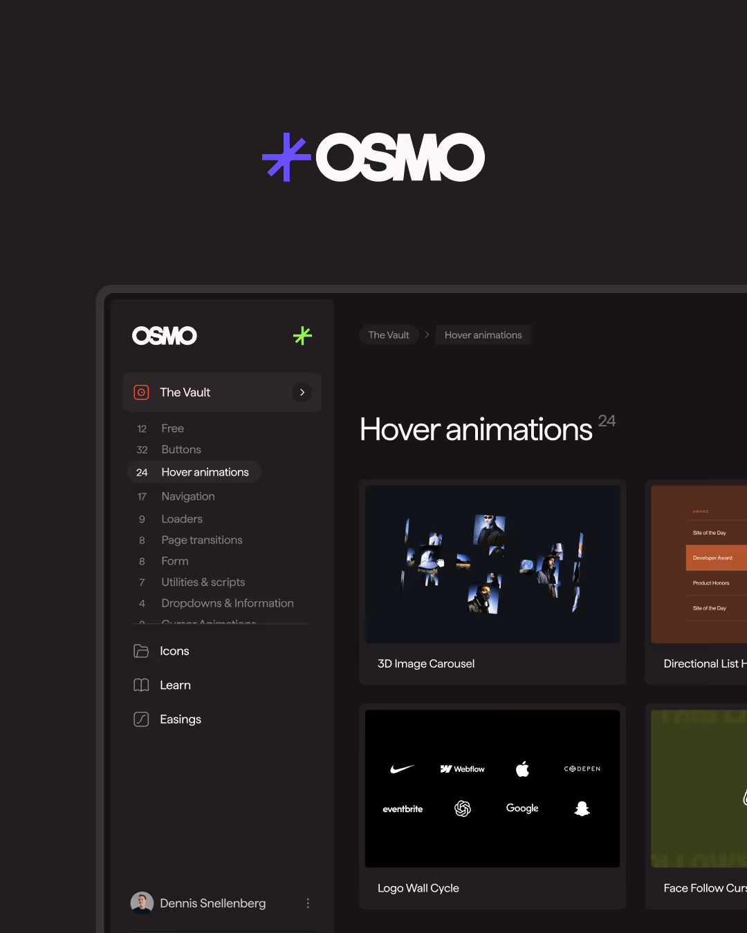
Resource details
Last updated
December 16, 2025
Category
Sections & Layouts
Need help?
Join Slack
Original source
 Ilja van Eck
Creator Credits
We always strive to credit creators as accurately as possible. While similar concepts might appear online, we aim to provide proper and respectful attribution.