


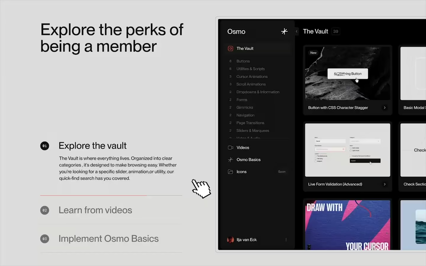
Modal
Pop-up
Information
Read
Toggle
Basic
Setup
Resources
Icons (SVG)
We couldn't found a match for "Lorem ipsum"
Hey Name, we are super excited to have you on board. Thanks for the support and hopefully Osmo becomes your go-to place for inspiration and development tips-and-tricks. Enjoy! - Ilja & Dennis

We’re offering an exclusive €50 discount when you upgrade to a Lifetime membership. We’ll deduct the cost of your current subscription cycle.
Lifetime Bonus
As a bonus you’ll also receive our complete marketing website—as a Webflow cloneable or a folder containing all HTML, CSS & JS assets.
Use discount code:
TPJH9Q26
Upgrade to lifetime
Unfortunately, we don’t currently have the capacity to answer all questions individually—but that’s why we created the Osmo community!
It’s a space where members can come together to share tips, troubleshoot, and collaborate. Whether you’re dealing with a tricky bug, need advice, or just want to connect with like-minded creatives, our community is here for you.
Default

Default
Name
Lorem ipsum dolor sit amet, consectetur adipiscing elit. Suspendisse varius enim in eros elementum tristique. Duis cursus, mi quis viverra ornare, eros dolor interdum nulla, ut commodo diam libero vitae erat. Aenean faucibus nibh et justo cursus id rutrum lorem imperdiet. Nunc ut sem vitae risus tristique posuere.
Lorem ipsum dolor sit amet, consectetur adipiscing elit. Suspendisse varius enim in eros elementum tristique. Duis cursus, mi quis viverra ornare, eros dolor interdum nulla, ut commodo diam libero vitae erat. Aenean faucibus nibh et justo cursus id rutrum lorem imperdiet. Nunc ut sem vitae risus tristique posuere.
Lorem ipsum dolor sit amet, consectetur adipiscing elit. Suspendisse varius enim in eros elementum tristique. Duis cursus, mi quis viverra ornare, eros dolor interdum nulla, ut commodo diam libero vitae erat. Aenean faucibus nibh et justo cursus id rutrum lorem imperdiet. Nunc ut sem vitae risus tristique posuere.
Subscription
0 days

Webflow
Code
Setup: External Scripts
Make sure to always put the External Scripts before the Javascript step of the resource.
In this video you learn where to put these in your Webflow project? Or how to include a paid GSAP Club plugin in your project?
HTML
Step 1: Copy structure to Webflow
In the video below we described how you can copy + paste the structure of this resource to your Webflow project.
Copy to Webflow
Webflow structure is not required for this resource.
Step 1: Add HTML
HTML
<div data-modal-group-status="not-active" class="modal">
  <div data-modal-close="" class="modal__dark"></div>
  <div data-modal-name="modal-a" data-modal-status="not-active" class="modal__card">
    <div class="modal__scroll">
      <div class="modal__content">
        <h2 class="modal__h2">Modal A</h2>
        <p class="modal__p">Lorem ipsum dolor sit amet, consectetur adipiscing elit, sed do eiusmod tempor incididunt ut labore et dolore magna aliqua. Ut enim ad minim veniam, quis nostrud exercitation ullamco laboris nisi ut aliquip ex ea commodo consequat. Duis aute irure dolor in reprehenderit in voluptate velit esse cillum dolore eu fugiat nulla pariatur. Excepteur sint occaecat cupidatat non proident, sunt in culpa qui officia deserunt mollit anim id est laborum.</p>
      </div>
    </div>
    <div data-modal-close="" class="modal__btn-close"><div class="modal__btn-close-bar"></div><div class="modal__btn-close-bar is--second"></div></div>
  </div>
  <div data-modal-name="modal-b" data-modal-status="not-active" class="modal__card">
    <div class="modal__scroll">
      <div class="modal__content">
        <h2 class="modal__h2">Modal B</h2>
        <p class="modal__p">Lorem ipsum dolor sit amet, consectetur adipiscing elit, sed do eiusmod tempor incididunt ut labore et dolore magna aliqua. Ut enim ad minim veniam, quis nostrud exercitation ullamco laboris nisi ut aliquip ex ea commodo consequat. Duis aute irure dolor in reprehenderit in voluptate velit esse cillum dolore eu fugiat nulla pariatur. Excepteur sint occaecat cupidatat non proident, sunt in culpa qui officia deserunt mollit anim id est laborum.</p>
      </div>
    </div>
    <div data-modal-close="" class="modal__btn-close"><div class="modal__btn-close-bar"></div><div class="modal__btn-close-bar is--second"></div></div>
  </div>
</div>

<div data-modal-target="modal-a" data-modal-status="not-active" class="demo-btn"><p class="demo-btn__p">Modal A</p></div>
<div data-modal-target="modal-b" data-modal-status="not-active" class="demo-btn"><p class="demo-btn__p">Modal B</p></div>
HTML structure is not required for this resource.
Step 2: Add CSS
CSS
.modal {
  z-index: 100;
  opacity: 0;
  pointer-events: none;
  visibility: hidden;
  justify-content: center;
  align-items: center;
  padding: 2em 1em;
  display: flex;
  position: fixed;
  inset: 0;
  overflow: hidden;
  transition: all 0.2s linear;
}

.modal[data-modal-group-status="active"] {
  opacity: 1;
  visibility: visible;
}

.modal__dark {
  opacity: .5;
  pointer-events: auto;
  cursor: pointer;
  background-color: #131313;
  width: 100%;
  height: 100%;
  position: absolute;
  top: 0;
  left: 0;
}

.modal__card {
  pointer-events: auto;
  background-color: #efeeec;
  border-radius: 2em;
  width: 100%;
  max-width: 54em;
  max-height: 100%;
  padding: .75em;
  display: none;
  position: relative;
}

.modal__card[data-modal-status="active"] {
  display: flex;
}

.modal__scroll {
  grid-column-gap: 1.5em;
  grid-row-gap: 1.5em;
  background-color: #e2e1df;
  border-radius: 1.25em;
  flex-flow: column;
  width: 100%;
  max-height: 100%;
  display: flex;
  position: relative;
  overflow: scroll;
}

.modal__content {
  grid-column-gap: 1.5em;
  grid-row-gap: 1.5em;
  flex-flow: column;
  padding: 2em;
  display: flex;
}

.modal__h2 {
  margin-top: 0;
  margin-bottom: 0;
  font-size: 2.5em;
  font-weight: 500;
  line-height: 1.175;
}

.modal__p {
  margin-bottom: 0;
  font-size: 1em;
  line-height: 1.5;
}

.modal__btn-close {
  background-color: #efeeec;
  border-radius: 50%;
  justify-content: center;
  align-items: center;
  width: 3.5em;
  height: 3.5em;
  display: flex;
  position: absolute;
  top: 2.5em;
  right: 2.5em;
}

.modal__btn-close-bar {
  background-color: currentColor;
  width: .125em;
  height: 40%;
  position: absolute;
  transform: rotate(45deg);
}

.modal__btn-close-bar.is--second {
  transform: rotate(-45deg);
}

/* Demo Buttons */

.demo-btn {
  background-color: #efeeec;
  border-radius: 50em;
  justify-content: center;
  align-items: center;
  display: flex;
  position: relative;
}

.demo-btn__p {
  margin-bottom: 0;
  padding: .65em 1.25em;
  font-size: 1em;
}
Step 2: Add custom Javascript
In this video, Ilja gives you some guidance about using JavaScript in Webflow:
Step 2: Add Javascript
Step 3: Add Javascript
Javascript
function initModalBasic() {

  const modalGroup = document.querySelector('[data-modal-group-status]');
  const modals = document.querySelectorAll('[data-modal-name]');
  const modalTargets = document.querySelectorAll('[data-modal-target]');

  // Open modal
  modalTargets.forEach((modalTarget) => {
    modalTarget.addEventListener('click', function () {
      const modalTargetName = this.getAttribute('data-modal-target');

      // Close all modals
      modalTargets.forEach((target) => target.setAttribute('data-modal-status', 'not-active'));
      modals.forEach((modal) => modal.setAttribute('data-modal-status', 'not-active'));

      // Activate clicked modal
      document.querySelector(`[data-modal-target="${modalTargetName}"]`).setAttribute('data-modal-status', 'active');
      document.querySelector(`[data-modal-name="${modalTargetName}"]`).setAttribute('data-modal-status', 'active');

      // Set group to active
      if (modalGroup) {
        modalGroup.setAttribute('data-modal-group-status', 'active');
      }
    });
  });

  // Close modal
  document.querySelectorAll('[data-modal-close]').forEach((closeBtn) => {
    closeBtn.addEventListener('click', closeAllModals);
  });

  // Close modal on `Escape` key
  document.addEventListener('keydown', function (event) {
    if (event.key === 'Escape') {
      closeAllModals();
    }
  });

  // Function to close all modals
  function closeAllModals() {
    modalTargets.forEach((target) => target.setAttribute('data-modal-status', 'not-active'));

    if (modalGroup) {
      modalGroup.setAttribute('data-modal-group-status', 'not-active');
    }
  }
}

// Initialize Basic Modal
document.addEventListener('DOMContentLoaded', () => {
  initModalBasic();
});
Step 3: Add custom CSS
Step 2: Add custom CSS
Curious about where to put custom CSS in Webflow? Ilja explains it in the below video:
CSS
[data-modal-group-status] {
  transition: all 0.2s linear;
}

[data-modal-group-status="active"] {
  opacity: 1;
  visibility: visible;
}

[data-modal-name][data-modal-status="active"] {
  display: flex;
}Use the attribute [data-modal-group-status="not-active"] on a parent container to indicate the modal group’s overall status. This container will receive the attribute [data-modal-group-status="active"] when any modal in the group is active. This can be used to style the full modal group. For example the dark background behind the modal elements.
Add the attribute [data-modal-target="example"] to the element that triggers a modal. The value of this attribute should match the corresponding modal’s [data-modal-name] attribute.
For example:
<button data-modal-target="example-modal" data-modal-status="not-active">Open Modal</button>Add [data-modal-name="example"] to each modal. The value of this attribute should match the [data-modal-target] value of the triggering element. The [data-modal-status="active"] attribute will be used to show and style the activated button and/or modal.
Add the attribute [data-modal-close] to any element inside the [data-modal-group-status] element that should close it. We also added support for the user to click the "Escape" key on the keyboard to close the modal.
Resource Details
Last updated
January 28, 2025
Type
Osmo Basics
Category
Dropdowns & Information
Need help?
Join Slack
Original source
 Dennis Snellenberg
We always strive to credit creators as accurately as possible. While similar concepts might appear online, we aim to provide proper and respectful attribution.