


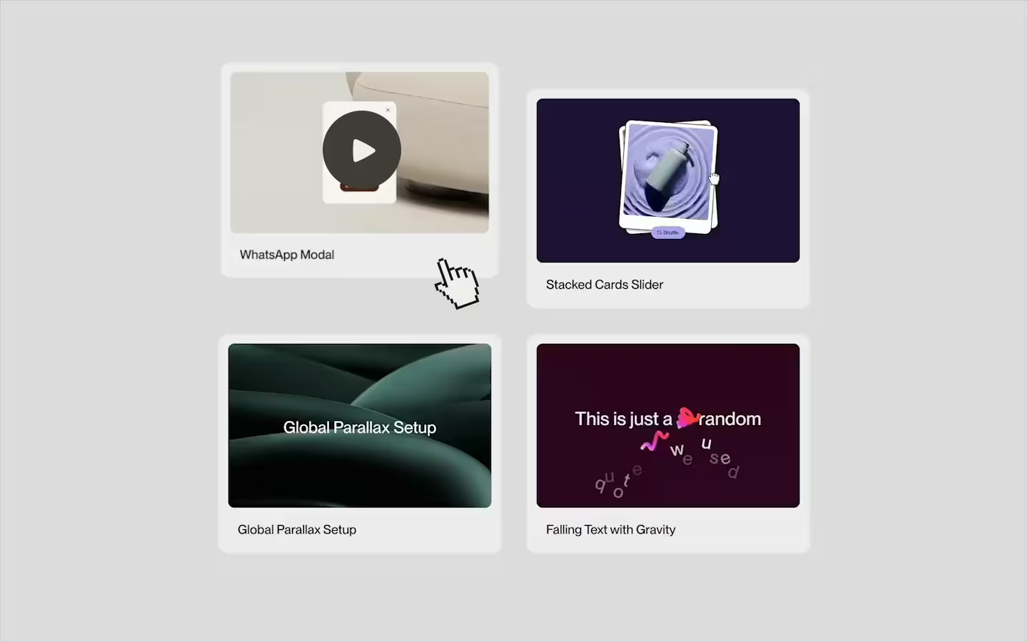
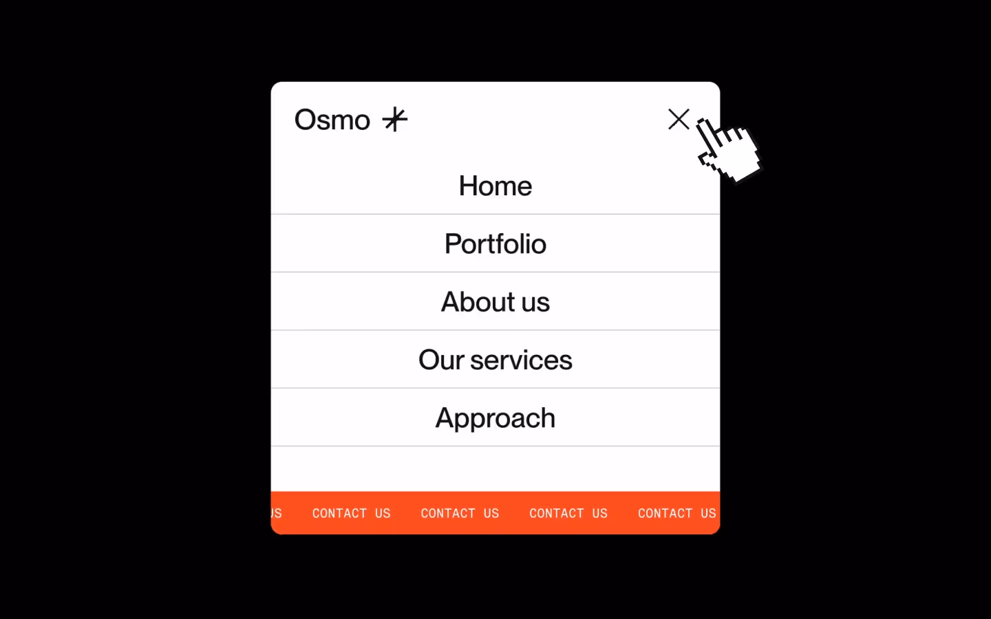
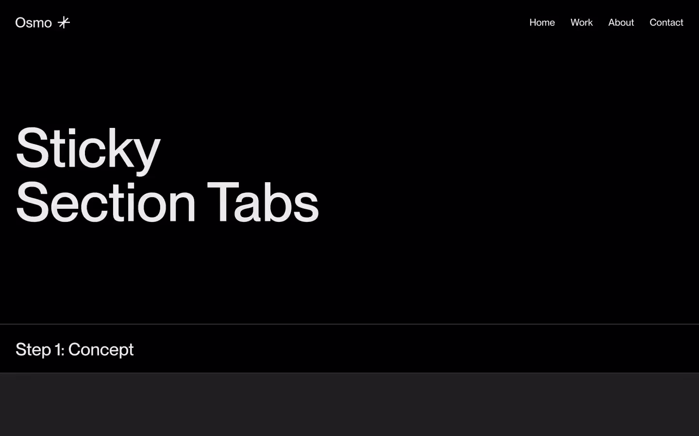
Side Navigation with Wipe Effect

Documentation
Webflow
Code
Setup: External Scripts
External Scripts in Webflow
Make sure to always put the External Scripts before the Javascript step of the resource.
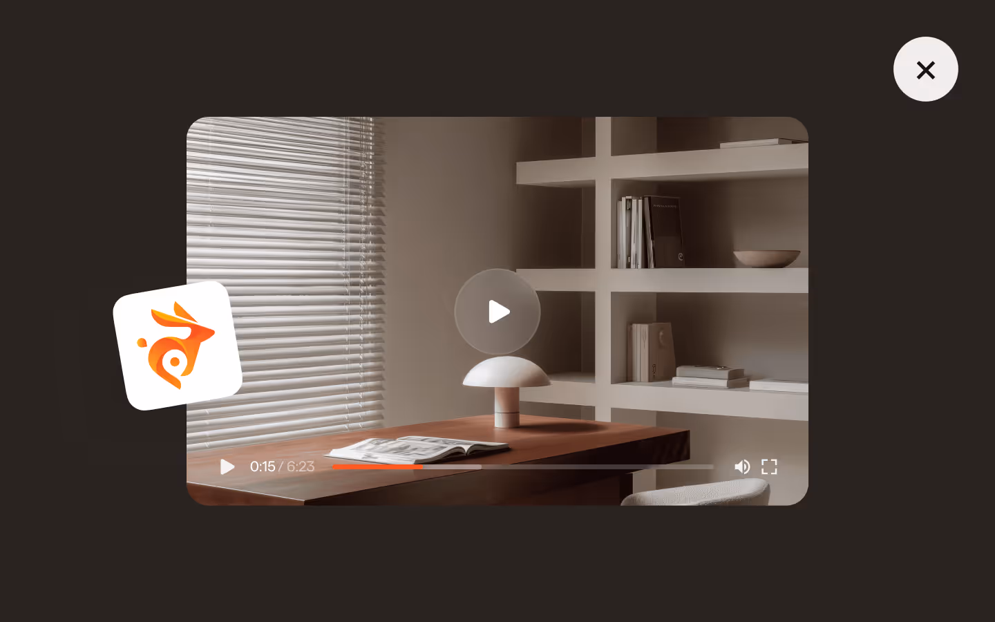
In this video you learn where to put these in your Webflow project? Or how to include a paid GSAP Club plugin in your project?
HTML
<script src="https://cdn.jsdelivr.net/npm/gsap@3.13.0/dist/gsap.min.js"></script>
<script src="https://cdn.jsdelivr.net/npm/gsap@3.13.0/dist/CustomEase.min.js"></script>
Step 1: Copy structure to Webflow
Copy structure to Webflow
In the video below we described how you can copy + paste the structure of this resource to your Webflow project.
Copy to Webflow
Webflow structure is not required for this resource.
Step 1: Add HTML
HTML
<div class="sidenav">
  <header class="sidenav__header"><button role="button" data-sidenav-toggle="" data-sidenav-button="" class="sidenav__button">
      <div class="sidenav__button-text">
        <p data-sidenav-label="" class="sidenav__button-label">Menu</p>
        <p data-sidenav-label="" class="sidenav__button-label">Close</p>
      </div>
      <div data-sidenav-icon="" class="sidenav__button-icon">
        <svg xmlns="http://www.w3.org/2000/svg" width="100%" viewbox="0 0 16 16" fill="none" class="sidenav__button-icon-svg">
          <path d="M7.33333 16L7.33333 -3.2055e-07L8.66667 -3.78832e-07L8.66667 16L7.33333 16Z" fill="currentColor"></path>
          <path d="M16 8.66667L-2.62269e-07 8.66667L-3.78832e-07 7.33333L16 7.33333L16 8.66667Z" fill="currentColor"></path>
          <path d="M6 7.33333L7.33333 7.33333L7.33333 6C7.33333 6.73637 6.73638 7.33333 6 7.33333Z" fill="currentColor"></path>
          <path d="M10 7.33333L8.66667 7.33333L8.66667 6C8.66667 6.73638 9.26362 7.33333 10 7.33333Z" fill="currentColor"></path>
          <path d="M6 8.66667L7.33333 8.66667L7.33333 10C7.33333 9.26362 6.73638 8.66667 6 8.66667Z" fill="currentColor"></path>
          <path d="M10 8.66667L8.66667 8.66667L8.66667 10C8.66667 9.26362 9.26362 8.66667 10 8.66667Z" fill="currentColor"></path>
        </svg>
      </div>
    </button>
  </header>
  <div data-sidenav-wrap="" data-nav-state="closed" class="sidenav__nav">
    <div data-sidenav-overlay="" data-sidenav-toggle="" class="sidenav__overlay"></div>
    <nav data-sidenav-menu="" class="sidenav__menu">
      <div class="sidenav__menu-bg">
        <div data-sidenav-panel="" class="sidenav__menu-bg-panel is--first"></div>
        <div data-sidenav-panel="" class="sidenav__menu-bg-panel is--second"></div>
        <div data-sidenav-panel="" class="sidenav__menu-bg-panel"></div>
      </div>
      <div class="sidenav__menu-inner">
        <ul class="sidenav__menu-list">
          <li class="sidenav__menu-list-item">
            <a data-sidenav-link="" href="#" class="sidenav__menu-link">
              <p class="sidenav__menu-link-heading">About us</p>
              <p class="sidenav__menu-link-eyebrow">01</p>
            </a>
          </li>
          <li class="sidenav__menu-list-item">
            <a data-sidenav-link="" href="#" class="sidenav__menu-link">
              <p class="sidenav__menu-link-heading">Our work</p>
              <p class="sidenav__menu-link-eyebrow">02</p>
            </a>
          </li>
          <li class="sidenav__menu-list-item">
            <a data-sidenav-link="" href="#" class="sidenav__menu-link">
              <p class="sidenav__menu-link-heading">Services</p>
              <p class="sidenav__menu-link-eyebrow">03</p>
            </a>
          </li>
          <li class="sidenav__menu-list-item">
            <a data-sidenav-link="" href="#" class="sidenav__menu-link">
              <p class="sidenav__menu-link-heading">Blog</p>
              <p class="sidenav__menu-link-eyebrow">04</p>
            </a>
          </li>
          <li class="sidenav__menu-list-item">
            <a data-sidenav-link="" href="#" class="sidenav__menu-link">
              <p class="sidenav__menu-link-heading">Contact us</p>
              <p class="sidenav__menu-link-eyebrow">05</p>
            </a>
          </li>
        </ul>
        <div class="sidenav__menu-details">
          <p data-sidenav-fade="" class="sidenav__button-label">Socials</p>
          <div class="sidenav__menu-socials">
            <a data-sidenav-fade="" href="#" class="sidenav__button-label">Instagram</a>
            <a data-sidenav-fade="" href="#" class="sidenav__button-label">LinkedIn</a>
            <a data-sidenav-fade="" href="#" class="sidenav__button-label">X/Twitter</a>
            <a data-sidenav-fade="" href="#" class="sidenav__button-label">Awwwards</a>
          </div>
        </div>
      </div>
    </nav>
  </div>
</div>
HTML structure is not required for this resource.
Step 2: Add CSS
CSS
.sidenav__header {
  z-index: 10;
  justify-content: flex-end;
  align-items: center;
  display: flex;
  position: fixed;
  top: 2em;
  left: 2em;
  right: 2em;
}

.sidenav__button {
  z-index: 10;
  grid-column-gap: .625em;
  grid-row-gap: .625em;
  background-color: #0000;
  justify-content: flex-end;
  align-items: center;
  margin: -1em;
  padding: 1em;
  display: flex;
  border: none;
}

.sidenav__button-text {
  flex-flow: column;
  justify-content: flex-start;
  align-items: flex-end;
  height: 1.5em;
  display: flex;
  overflow: hidden;
}

.sidenav__button-icon {
  justify-content: center;
  align-items: center;
  width: 1em;
  height: 1em;
  transition: transform .4s cubic-bezier(.65, .05, 0, 1);
  display: flex;
}

.sidenav__button-icon-svg {
  width: 100%;
}

.sidenav__button-label {
  color: #131313;
  margin-top: 0;
  margin-bottom: 0;
  font-size: 1.125em;
  line-height: 1.4;
}

.sidenav__nav {
  z-index: 9;
  width: 100%;
  height: 100vh;
  margin-left: auto;
  margin-right: auto;
  display: none;
  position: fixed;
  inset: 0%;
}

.sidenav__overlay {
  z-index: 0;
  cursor: pointer;
  background-color: #13131366;
  width: 100%;
  height: 100%;
  position: absolute;
  inset: 0%;
}

.sidenav__menu {
  grid-column-gap: 5em;
  grid-row-gap: 5em;
  flex-flow: column;
  justify-content: space-between;
  align-items: flex-start;
  width: 35em;
  height: 100%;
  margin-left: auto;
  padding-top: 6em;
  padding-bottom: 2em;
  position: relative;
  overflow: auto;
}

.sidenav__menu-bg {
  z-index: 0;
  position: absolute;
  inset: 0%;
}

.sidenav__menu-bg-panel {
  z-index: 0;
  background-color: #ebdcc5;
  border-top-left-radius: 1.25em;
  border-bottom-left-radius: 1.25em;
  position: absolute;
  inset: 0%;
}

.sidenav__menu-bg-panel.is--first {
  background-color: #e04645;
}

.sidenav__menu-bg-panel.is--second {
  background-color: #131313;
}

.sidenav__menu-inner {
  z-index: 1;
  grid-column-gap: 5em;
  grid-row-gap: 5em;
  flex-flow: column;
  justify-content: space-between;
  align-items: flex-start;
  height: 100%;
  display: flex;
  position: relative;
  overflow: auto;
}

.sidenav__menu-list {
  flex-flow: column;
  width: 100%;
  margin-bottom: 0;
  padding-left: 0;
  list-style: none;
  display: flex;
}

.sidenav__menu-list-item {
  height: 6em;
  margin-top: 0;
  margin-bottom: 0;
  position: relative;
  overflow: hidden;
}

.sidenav__menu-link {
  grid-column-gap: .75em;
  grid-row-gap: .75em;
  color: #131313;
  width: 100%;
  padding-top: .75em;
  padding-bottom: .75em;
  padding-left: 2em;
  text-decoration: none;
  display: flex;
}

.sidenav__menu-link-heading {
  z-index: 1;
  font-family: PP Neue Corp Tight, Arial, sans-serif;
  font-size: 5.625em;
  font-weight: 700;
  line-height: .75;
  transition: transform .55s cubic-bezier(.65, .05, 0, 1);
  position: relative;
  margin: 0px;
  letter-spacing: -0.015em;
}

.sidenav__menu-link-eyebrow {
  z-index: 1;
  color: #e04645;
  text-transform: uppercase;
  font-family: RM Mono, Arial, sans-serif;
  font-weight: 400;
  position: relative;
}

.sidenav__menu-details {
  grid-column-gap: 1.25em;
  grid-row-gap: 1.25em;
  flex-flow: column;
  justify-content: flex-start;
  align-items: flex-start;
  padding-left: 2em;
  display: flex;
}

.sidenav__menu-socials {
  grid-column-gap: 1.5em;
  grid-row-gap: 1.5em;
  flex-flow: row;
  display: flex;
}


.noscript {
  pointer-events: none;
  width: 0;
  height: 0;
  position: absolute;
  top: 0;
  left: 0;
  overflow: hidden;
}

@media screen and (max-width: 767px) {
  .sidenav__menu-socials {
    grid-column-gap: 1em;
    grid-row-gap: 1em;
  }

  .sidenav__menu-bg-panel {
    border-top-left-radius: 0;
    border-bottom-left-radius: 0;
  }

  .sidenav__menu {
    width: 100%;
  }

  .sidenav__menu-list-item {
    height: 4.5em;
  }

  .sidenav__menu-link-heading {
    font-size: 4em;
  }
}
Step 2: Add custom Javascript
Custom Javascript in Webflow
In this video, Ilja gives you some guidance about using JavaScript in Webflow:
Step 2: Add Javascript
Step 3: Add Javascript
Javascript
gsap.registerPlugin(CustomEase);

CustomEase.create( "main", "0.65, 0.01, 0.05, 0.99" );

gsap.defaults({
  ease:"main",
  duration:0.7
});

function initSideNavWipeEffect(){

  let navWrap = document.querySelector("[data-sidenav-wrap]");
  let state = navWrap.getAttribute("data-nav-state");
  let overlay = navWrap.querySelector("[data-sidenav-overlay]");
  let menu = navWrap.querySelector("[data-sidenav-menu]");
  let bgPanels = navWrap.querySelectorAll("[data-sidenav-panel]");
  let menuToggles = document.querySelectorAll("[data-sidenav-toggle]");
  let menuLinks = navWrap.querySelectorAll("[data-sidenav-link]");
  let fadeTargets = navWrap.querySelectorAll("[data-sidenav-fade]");
  let menuButton = document.querySelector("[data-sidenav-button]");
  let menuButtonTexts = menuButton.querySelectorAll("[data-sidenav-label]");
  let menuButtonIcon = menuButton.querySelector("[data-sidenav-icon]");

  let tl = gsap.timeline()

  const openNav = () =>{
    navWrap.setAttribute("data-nav-state", "open");

    tl.clear()
    .set(navWrap,{display:"block"})
    .set(menu,{xPercent:0},"<")
    .fromTo(menuButtonTexts,{yPercent:0},{yPercent:-100,stagger:0.2})
    .fromTo(menuButtonIcon,{rotate:0},{rotate:315},"<")
    .fromTo(overlay,{autoAlpha:0},{autoAlpha:1},"<")
    .fromTo(bgPanels,{xPercent:101},{xPercent:0,stagger:0.12,duration: 0.575},"<")
    .fromTo(menuLinks,{yPercent:140,rotate:10},{yPercent:0, rotate:0,stagger:0.05},"<+=0.35")
    .fromTo(fadeTargets,{autoAlpha:0,yPercent:50},{autoAlpha:1, yPercent:0,stagger:0.04},"<+=0.2");
  }

  const closeNav = () =>{
    navWrap.setAttribute("data-nav-state", "closed");

    tl.clear()
    .to(overlay,{autoAlpha:0})
    .to(menu,{xPercent:120},"<")
    .to(menuButtonTexts,{yPercent:0},"<")
    .to(menuButtonIcon,{rotate:0},"<")
    .set(navWrap,{display:"none"});
  }

  // Toggle menu open / close depending on its current state
  menuToggles.forEach((toggle) => {
    toggle.addEventListener("click", () => {
      state = navWrap.getAttribute("data-nav-state");
      if (state === "open") {
        closeNav();
      } else {
        openNav();
      }
    });
  });

  // If menu is open, you can close it using the "escape" key
  document.addEventListener("keydown", (e) => {
    if (e.key === "Escape" && navWrap.getAttribute("data-nav-state") === "open") {
      closeNav();
    }
  });
}

// Initialize Draggable Infinite GSAP Slider
document.addEventListener("DOMContentLoaded", () => {
  initSideNavWipeEffect();
});
Step 3: Add custom CSS
Step 2: Add custom CSS
Custom CSS in Webflow
Curious about where to put custom CSS in Webflow? Ilja explains it in the below video:
CSS
Implementation
Toggle
Attach [data-sidenav-toggle] to any element that should open or close the navigation. When clicked, it checks the [data-nav-state] on the wrapper and switches between states. We add this to the menu button, but for example also on an overlay div that covers the rest of the page.
Menu
The [data-sidenav-menu] element contains all menu panels and links. It animates horizontally to reveal the panels during the wipe transition.
Panels
Each [data-sidenav-panel] represents one colored layer in the wipe effect. They slide in with staggered timing to create depth. The colors of these panels are defined in CSS, through their combo-class.
Fade Targets
Use [data-sidenav-fade] for smaller UI elements (e.g. social links or labels) that should fade in after the main content. These are animated after the main wipe completes.
Keyboard Support
The script listens for the Escape key. When pressed, it closes the menu if it has[data-nav-state="open"].
Resource details
Last updated
December 16, 2025
Category
Navigation
Need help?
Join Slack
Original source
 Ilja van Eck
Creator Credits
We always strive to credit creators as accurately as possible. While similar concepts might appear online, we aim to provide proper and respectful attribution.