


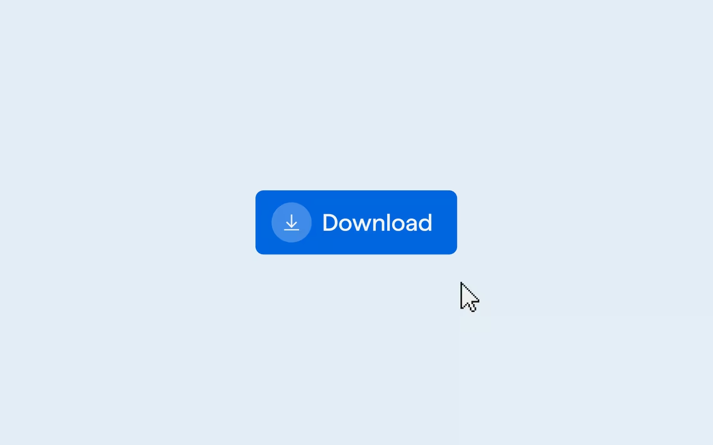
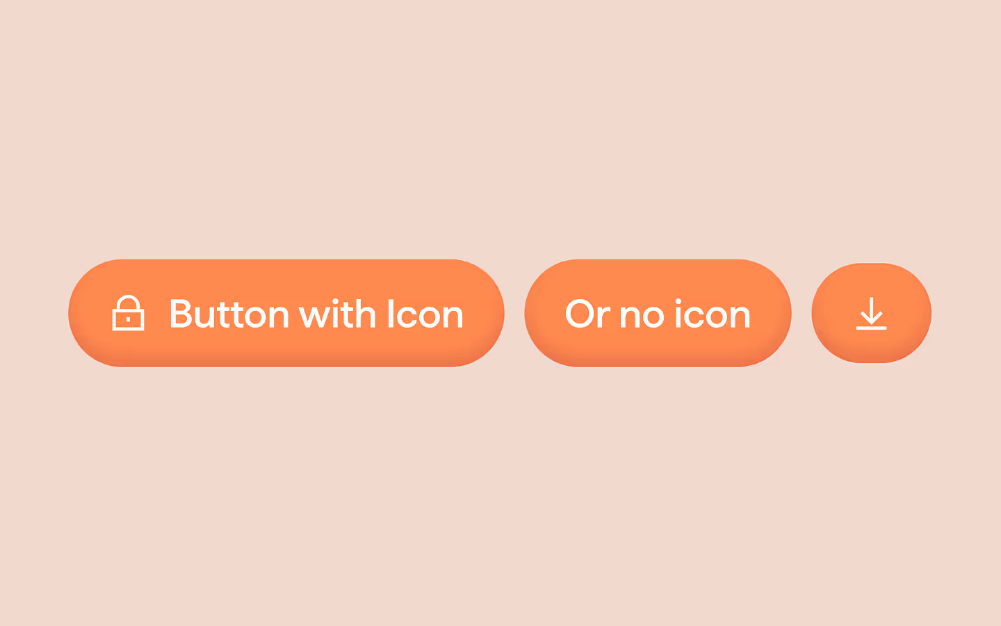
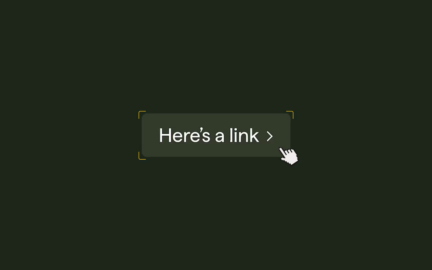
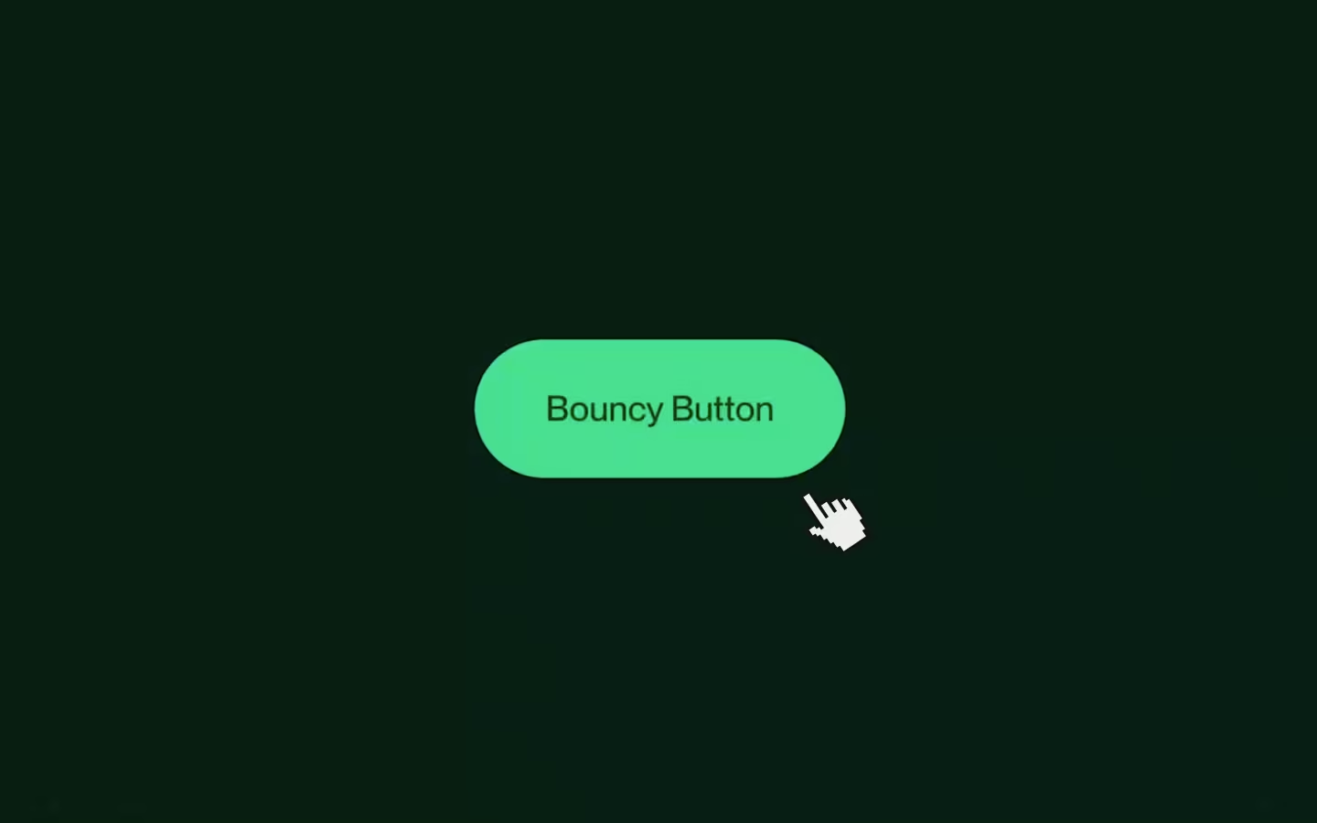
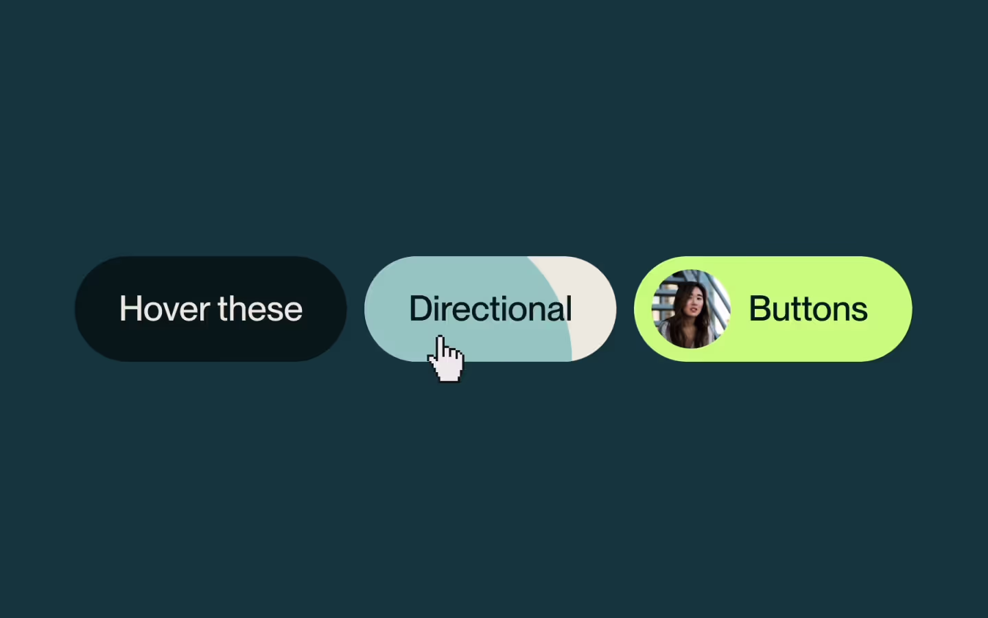
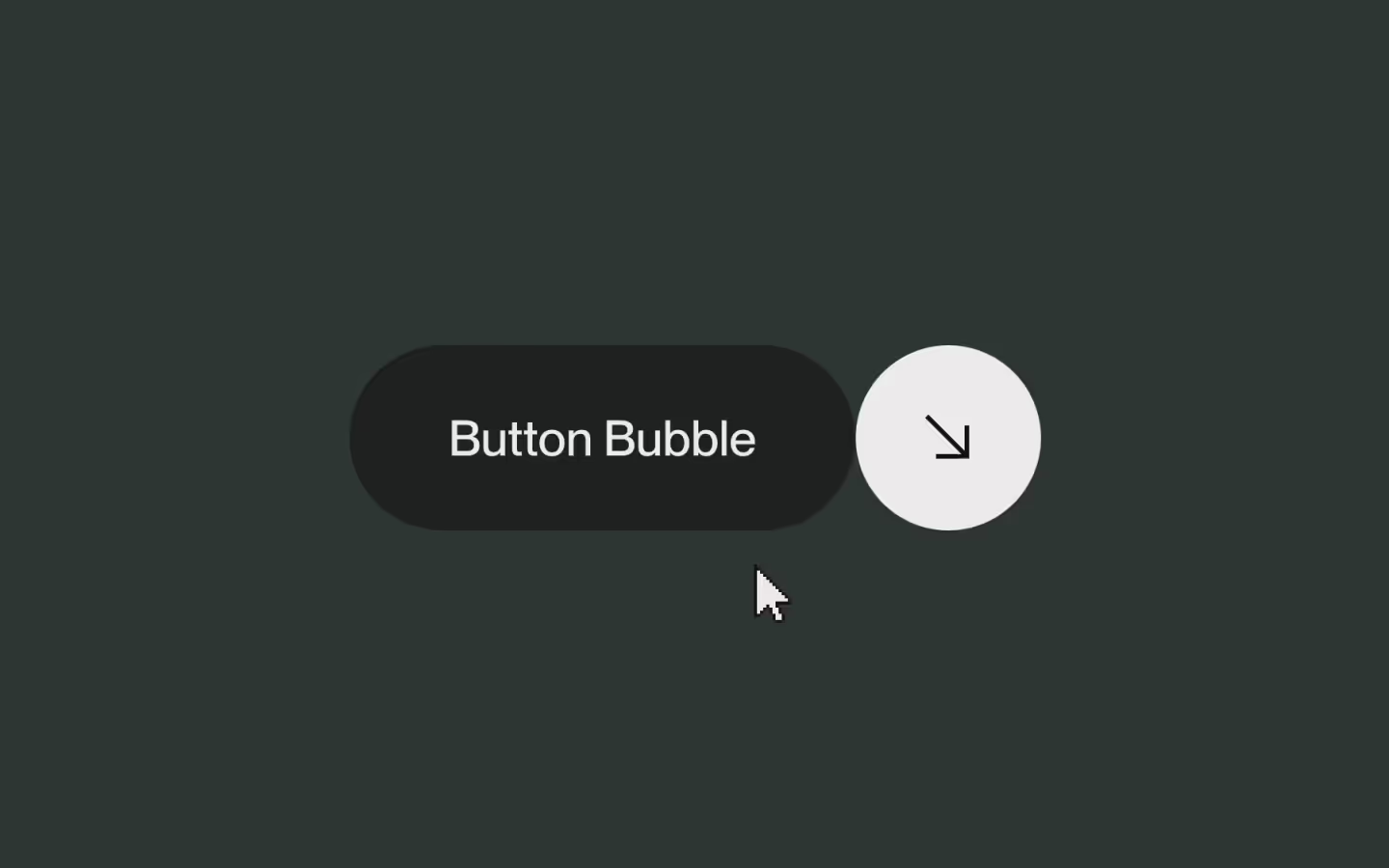
Button with Rotating Icon
Documentation
Webflow
Code
Setup: External Scripts
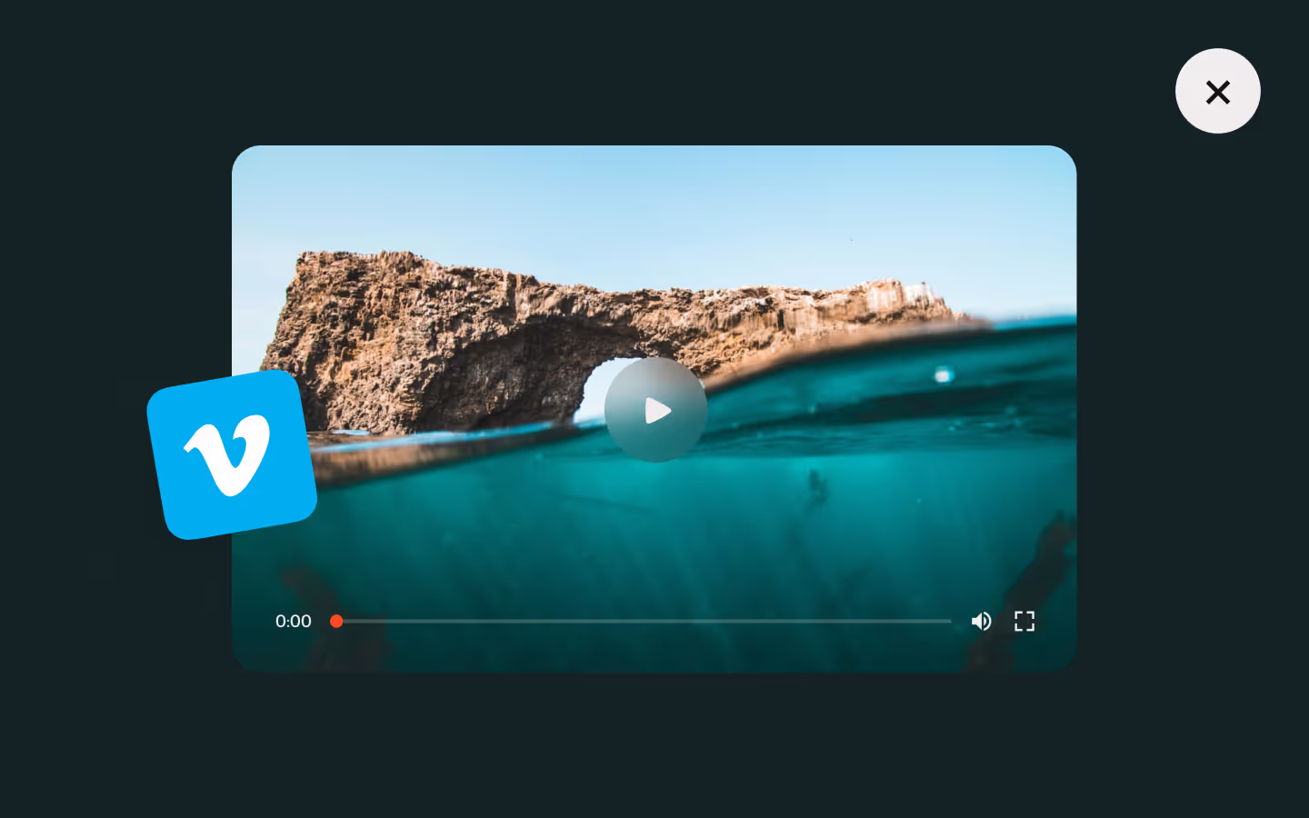
External Scripts in Webflow
Make sure to always put the External Scripts before the Javascript step of the resource.
In this video you learn where to put these in your Webflow project? Or how to include a paid GSAP Club plugin in your project?
HTML
Step 1: Copy structure to Webflow
Copy structure to Webflow
In the video below we described how you can copy + paste the structure of this resource to your Webflow project.
Copy to Webflow
Webflow structure is not required for this resource.
Step 1: Add HTML
HTML
<div class="btn-group">
  <a href="#" class="btn-icon-link w-inline-block">
    <div class="btn-icon-content">
      <div class="btn-icon-content__mask">
        <span data-button-anim-target="" class="btn-icon-content__text">Button with Icon</span>
      </div>
      <div data-icon-size="normal" class="btn-icon-icon">
        <div data-button-anim-target="" class="btn-icon-icon__bg"></div>
        <div class="btn-icon-icon__wrap">
          <div class="btn-icon-icon__list">
            <svg xmlns="http://www.w3.org/2000/svg" width="100%" viewbox="0 0 10 8" fill="none" data-button-anim-target="" class="btn-icon-icon__arrow"><path d="M4.45231 0.385986H6.02531L9.30131 3.99999L6.02531 7.61399H4.45231L7.40331 4.58499H0.695312V3.42799H7.41631L4.45231 0.385986Z" fill="currentColor"></path></svg>
            <svg xmlns="http://www.w3.org/2000/svg" width="100%" viewbox="0 0 10 8" fill="none" data-button-anim-target="" class="btn-icon-icon__arrow"><path d="M4.45231 0.385986H6.02531L9.30131 3.99999L6.02531 7.61399H4.45231L7.40331 4.58499H0.695312V3.42799H7.41631L4.45231 0.385986Z" fill="currentColor"></path></svg>
            <svg xmlns="http://www.w3.org/2000/svg" width="100%" viewbox="0 0 10 8" fill="none" data-button-anim-target="" class="btn-icon-icon__arrow"><path d="M4.45231 0.385986H6.02531L9.30131 3.99999L6.02531 7.61399H4.45231L7.40331 4.58499H0.695312V3.42799H7.41631L4.45231 0.385986Z" fill="currentColor"></path></svg>
          </div>
        </div>
      </div>
      <div data-button-anim-target="" class="btn-icon-content__bg"></div>
    </div>
  </a>
  <a href="#" class="btn-icon-link w-inline-block">
    <div class="btn-icon-content__mask">
      <span data-button-anim-target="" class="btn-icon-content__text">Button with Icon</span>
    </div>
    <div data-icon-size="normal" class="btn-icon-icon">
      <div data-button-anim-target="" class="btn-icon-icon__bg"></div>
      <div class="btn-icon-icon__wrap color--white">
        <div class="btn-icon-icon__list">
          <svg xmlns="http://www.w3.org/2000/svg" width="100%" viewbox="0 0 10 8" fill="none" data-button-anim-target="" class="btn-icon-icon__arrow"><path d="M4.45231 0.385986H6.02531L9.30131 3.99999L6.02531 7.61399H4.45231L7.40331 4.58499H0.695312V3.42799H7.41631L4.45231 0.385986Z" fill="currentColor"></path></svg>
          <svg xmlns="http://www.w3.org/2000/svg" width="100%" viewbox="0 0 10 8" fill="none" data-button-anim-target="" class="btn-icon-icon__arrow"><path d="M4.45231 0.385986H6.02531L9.30131 3.99999L6.02531 7.61399H4.45231L7.40331 4.58499H0.695312V3.42799H7.41631L4.45231 0.385986Z" fill="currentColor"></path></svg>
          <svg xmlns="http://www.w3.org/2000/svg" width="100%" viewbox="0 0 10 8" fill="none" data-button-anim-target="" class="btn-icon-icon__arrow"><path d="M4.45231 0.385986H6.02531L9.30131 3.99999L6.02531 7.61399H4.45231L7.40331 4.58499H0.695312V3.42799H7.41631L4.45231 0.385986Z" fill="currentColor"></path></svg>
        </div>
      </div>
    </div>
  </a>
</div>
HTML structure is not required for this resource.
Step 2: Add CSS
CSS
.btn-group {
  grid-column-gap: 3em;
  grid-row-gap: 3em;
  justify-content: center;
  display: flex;
}

.btn-icon-link {
  grid-column-gap: .5em;
  grid-row-gap: .5em;
  color: #a29a65;
  font-size: 1em;
  line-height: 1.2;
  text-decoration: none;
  display: flex;
}

.btn-icon-icon {
  z-index: 1;
  flex: none;
  justify-content: center;
  align-items: center;
  width: 1em;
  height: 1em;
  display: flex;
  position: relative;
}

.btn-icon-icon__bg {
  background-color: currentColor;
  border-radius: .125em;
  width: 100%;
  height: 100%;
  position: absolute;
}

.btn-icon-icon__wrap {
  color: #a29a65;
  justify-content: flex-end;
  align-items: center;
  width: 100%;
  height: 100%;
  display: flex;
  position: relative;
  overflow: hidden;
}

.btn-icon-icon__wrap.color--white {
  color: #fff;
}

.btn-icon-icon__list {
  flex: none;
  justify-content: flex-start;
  align-items: center;
  height: 100%;
  display: flex;
}

.btn-icon-icon__arrow {
  flex: none;
  width: 1em;
  height: 100%;
  padding: .2em;
}

.btn-icon-content {
  grid-column-gap: .5em;
  grid-row-gap: .5em;
  color: #fff;
  background-color: #a29a65;
  border-radius: .25em;
  justify-content: flex-start;
  align-items: center;
  padding: .6125em .75em;
  display: flex;
  position: relative;
  overflow: hidden;
}

.btn-icon-content__text {
  font-size: .875em;
}

.btn-icon-content__mask {
  z-index: 1;
  flex: none;
  justify-content: flex-start;
  align-items: center;
  display: flex;
  position: relative;
  overflow: hidden;
}

.btn-icon-content__bg {
  z-index: 0;
  background-color: #302d1c;
  width: 120%;
  height: 100%;
  position: absolute;
  bottom: 0%;
  left: -10%;
  transform: translate(0, 175%) rotate(15deg);
}

/* Global attribute to easily control easing and timing of all targetted elements */
[data-button-anim-target]{
  transition: transform 0.525s cubic-bezier(0.625, 0.05, 0, 1);
}

/* Fake a duplicate text element using text shadow without blur  */
/* We save the distance in a variable for easy use in the CSS animation */
.btn-icon-content__text{
  --text-duplicate-distance: 1.5em;
  text-shadow: 0px var(--text-duplicate-distance) currentColor;
}

/* Only apply hover animations if they are actually not supported */
@media (hover:hover) and (pointer:fine){

  .btn-icon-link:hover .btn-icon-content__text{ transform: translate(0px, calc(-1 * var(--text-duplicate-distance))); }

  .btn-icon-link:hover .btn-icon-icon__bg{ transform: rotate(90deg); }

  .btn-icon-link:hover .btn-icon-icon__arrow{ transform: translate(200%, 0px); }

  .btn-icon-link:hover .btn-icon-content__bg{ transform: translate(0px, 0%) rotate(0deg); }

}
Step 2: Add custom Javascript
Custom Javascript in Webflow
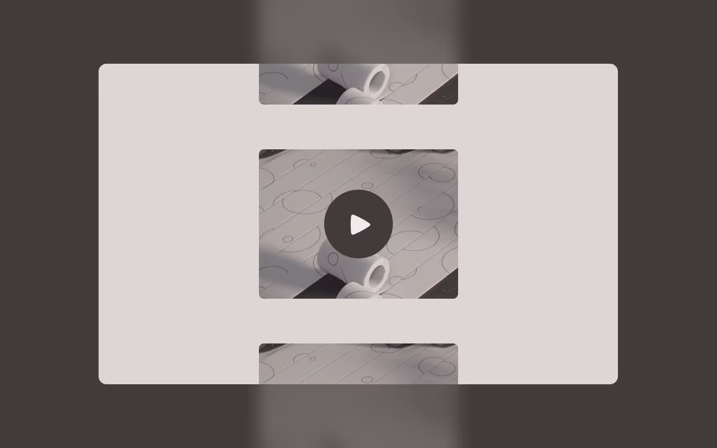
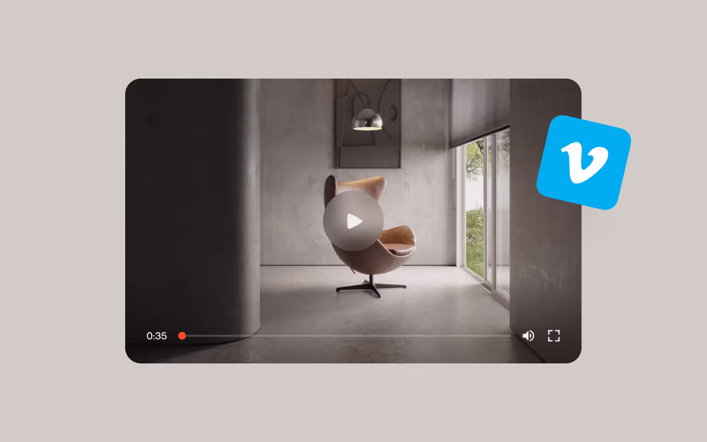
In this video, Ilja gives you some guidance about using JavaScript in Webflow:
Step 2: Add Javascript
Step 3: Add Javascript
Javascript
Step 3: Add custom CSS
Step 2: Add custom CSS
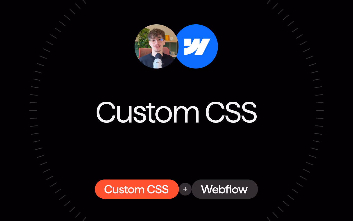
Custom CSS in Webflow
Curious about where to put custom CSS in Webflow? Ilja explains it in the below video:
CSS
/* Global attribute to easily control easing and timing of all targetted elements */
[data-button-anim-target]{
  transition: transform 0.525s cubic-bezier(0.625, 0.05, 0, 1);
}

/* Fake a duplicate text element using text shadow without blur  */
/* We save the distance in a variable for easy use in the CSS animation */
.btn-icon-content__text{
  --text-duplicate-distance: 1.5em;
  text-shadow: 0px var(--text-duplicate-distance) currentColor;
}

/* Only apply hover animations if they are actually not supported */
@media (hover:hover) and (pointer:fine){

  .btn-icon-link:hover .btn-icon-content__text{ transform: translate(0px, calc(-1 * var(--text-duplicate-distance))); }

  .btn-icon-link:hover .btn-icon-icon__bg{ transform: rotate(90deg); }

  .btn-icon-link:hover .btn-icon-icon__arrow{ transform: translate(200%, 0px); }

  .btn-icon-link:hover .btn-icon-content__bg{ transform: translate(0px, 0%) rotate(0deg); }

}
Implementation
By taking the .btn-icon-content__mask and .btn-icon-icon elements out of the .btn-icon-content element, we have a text-link only approach, so no background. As you'll see, the .btn-icon-content__bg (the 'wiping' bg on hover) is also optional, to add some more depth.
Changing icon colors
The arrows are SVG Path elements. Their fill is set to the CSS variable of currentColor. So to change the color of the arrows, simply change the font-color on .btn-icon-icon__wrap. Depending on your color combinations, you might want to change this on hover as well, but that's all dependent on your use-case!
Resource details
Last updated
December 16, 2025
Category
Buttons
Need help?
Join Slack
Original source
 Ilja van Eck
Creator Credits
We always strive to credit creators as accurately as possible. While similar concepts might appear online, we aim to provide proper and respectful attribution.