


Osmo Scaling System
00:00
/
00:00
Documentation
Webflow
Code
Setup: External Scripts
External Scripts in Webflow
Make sure to always put the External Scripts before the Javascript step of the resource.
In this video you learn where to put these in your Webflow project? Or how to include a paid GSAP Club plugin in your project?
HTML
Step 1: Copy structure to Webflow
Copy structure to Webflow
In the video below we described how you can copy + paste the structure of this resource to your Webflow project.
Copy to Webflow
Webflow structure is not required for this resource.
Step 1: Add HTML
HTML
HTML structure is not required for this resource.
Step 2: Add CSS
CSS
/* ------------------------- Scaling System by Osmo [https://osmo.supply/] -------------------------  */

/* Desktop */
:root {
  --size-unit: 16; /* body font-size in design - no px */
  --size-container-ideal: 1440; /* screen-size in design - no px */
  --size-container-min: 992px;
  --size-container-max: 1920px;
  --size-container: clamp(var(--size-container-min), 100vw, var(--size-container-max));
  --size-font: calc(var(--size-container) / (var(--size-container-ideal) / var(--size-unit)));
}

/* Tablet */
@media screen and (max-width: 991px) {
  :root {
    --size-container-ideal: 834; /* screen-size in design - no px */
    --size-container-min: 768px;
    --size-container-max: 991px;
  }
}

/* Mobile Landscape */
@media screen and (max-width: 767px) {
  :root {
    --size-container-ideal: 550; /* screen-size in design - no px */
    --size-container-min: 480px;
    --size-container-max: 767px;
  }
}

/* Mobile Portrait */
@media screen and (max-width: 479px) {
  :root {
    --size-container-ideal: 390; /* screen-size in design - no px */
    --size-container-min: 320px;
    --size-container-max: 479px;
  }
}
Step 2: Add custom Javascript
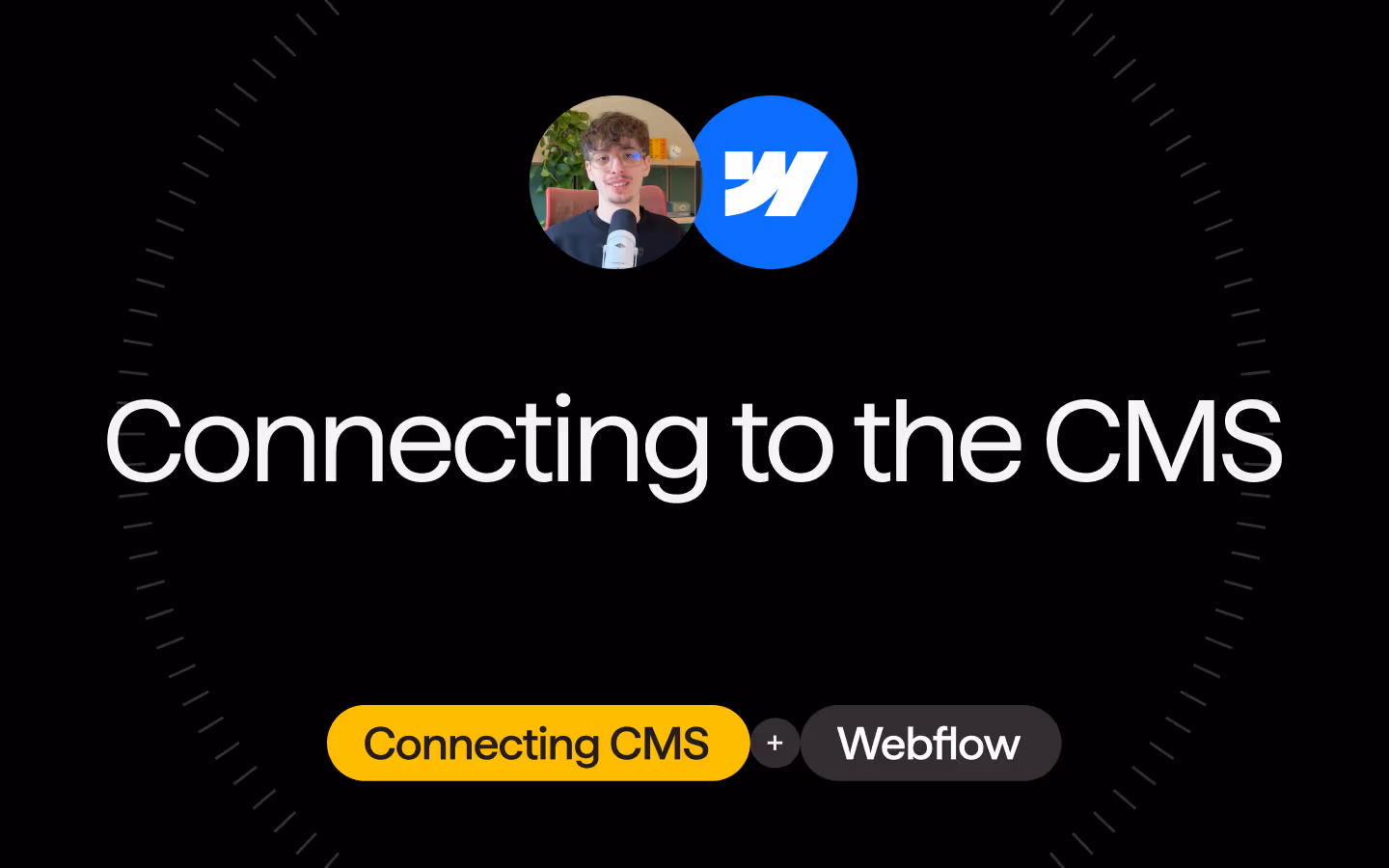
Custom Javascript in Webflow
In this video, Ilja gives you some guidance about using JavaScript in Webflow:
Step 2: Add Javascript
Step 3: Add Javascript
Javascript
Step 3: Add custom CSS
Step 2: Add custom CSS
Custom CSS in Webflow
Curious about where to put custom CSS in Webflow? Ilja explains it in the below video:
CSS
/* ------------------------- Scaling System by Osmo [https://osmo.supply/] -------------------------  */

/* Desktop */
:root {
  --size-unit: 16; /* body font-size in design - no px */
  --size-container-ideal: 1440; /* screen-size in design - no px */
  --size-container-min: 992px;
  --size-container-max: 1920px;
  --size-container: clamp(var(--size-container-min), 100vw, var(--size-container-max));
  --size-font: calc(var(--size-container) / (var(--size-container-ideal) / var(--size-unit)));
}

/* Tablet */
@media screen and (max-width: 991px) {
  :root {
    --size-container-ideal: 834; /* screen-size in design - no px */
    --size-container-min: 768px;
    --size-container-max: 991px;
  }
}

/* Mobile Landscape */
@media screen and (max-width: 767px) {
  :root {
    --size-container-ideal: 550; /* screen-size in design - no px */
    --size-container-min: 480px;
    --size-container-max: 767px;
  }
}

/* Mobile Portrait */
@media screen and (max-width: 479px) {
  :root {
    --size-container-ideal: 390; /* screen-size in design - no px */
    --size-container-min: 320px;
    --size-container-max: 479px;
  }
}
Implementation
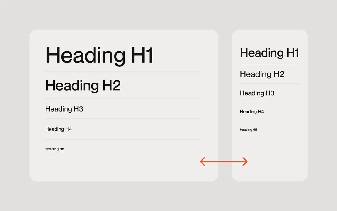
To make the scaling system work add the var(--size-font) variable to the font-size of the <body>
body {
  font-size: var(--size-font);
}
When using a container add the var(--size-container) variable to the max-width of the .container
.container {
  max-width: var(--size-container);
}

.container.medium {
  max-width: calc(var(--size-container) * 0.85);
}

.container.small {
  max-width: calc(var(--size-container) * 0.7);
}
Ideal container size
On the --size-container-ideal variable add the size of your design in Figma (no px behind the value)
Max container size
On each viewport you can define a --size-container-max for the scaling system. It will stop after that value is reached.
Resource details
Last updated
December 16, 2025
Category
Utilities & Scripts
Need help?
Join Slack
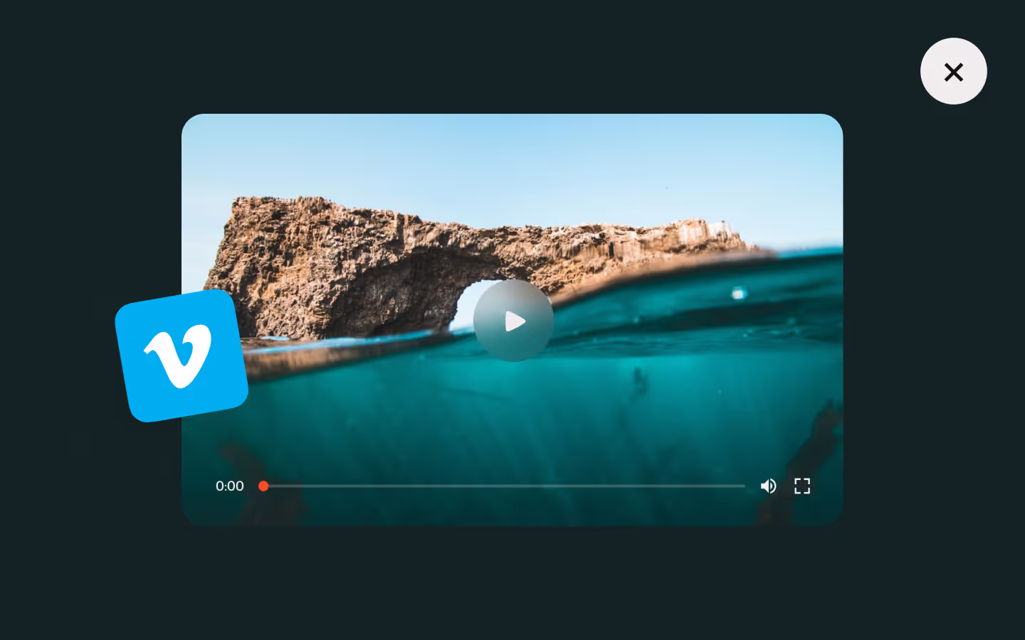
Watch the video
Hide the video
Original source
 Dennis Snellenberg
Creator Credits
We always strive to credit creators as accurately as possible. While similar concepts might appear online, we aim to provide proper and respectful attribution.